Building and
Branding an
Online Store
Roles: Logo Creation, Brand Building, Front End Web Design, WordPress and WooCommerce Setup
Colorado’s iconic wood signs were an early inspiration for typography.

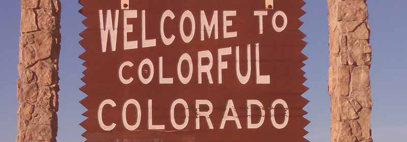
Colorado’s iconic wood signs were an early inspiration for typography.
Brand Planning and Conceptualization
Wakegraphic was asked to help a young local business. We would help develop the brand and help express that brand on their online store and social media pages.
Colorado Big Game Club is a Colorado wildlife, hunting, and trail conservation group. When this small business came to Wakegraphic, they were aiming on developing a strong social media presence right from the start so that they could start funneling their audience into their shop. They asked for a brand that would help them stand out from other conservation and hunting groups. They wanted a unique design. One inspired by the color and drama of the Rocky Mountains.
Market research came long before the first concepts were sketched. We examined competitor brands and their common design tropes and made recommendations to our client based on them.

Snapshots of some competitor branding. Typography choices varied while color was consistently blue and green hues.
Our research was clear. Competitors overwhelmingly used green and blue. Cool hues were the norm. It was a common sense brand decision. Lush green forests and clear blue skies dominated the photography on websites and ads. Cool blue and green hues complimented natural colors. One or two brands bucked the trends and used red or orange as a highlight color.
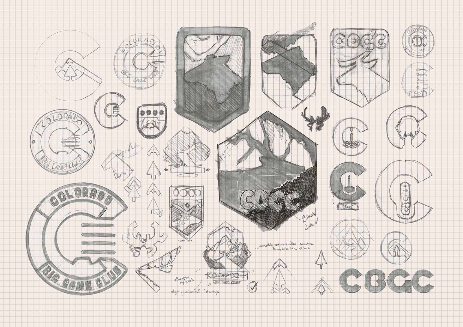
The circular design would be recycled and used as a design for t-shirts.

The four bars in a circle were inspired by a hunting bow’s sight system.




Creating a Unique Brand
Colorado, and the Rocky Mountains in general, holds a natural beauty. Its mountains are known for their red, iron-rich rocks and its aspen forests are known for their fiery fall colors. This beauty helped pull in over 77 million visitors and $19.2 billion in tourism money for Colorado in 2015.
The first banding decision was made before any site maps or brand concepts were drawn up. The company’s brand must stand apart from the crowd by using a gradient of Colorado’s red, orange, and yellow hues.
Typography was the next brand choice. The state’s iconic Welcome to Colorful Colorado signs and trail markers have greeted motorists and hikers across the state since the 1950s. “Highway Gothic,” was the original signs’ typeface, but it felt too thin and rigid on screens and in print.
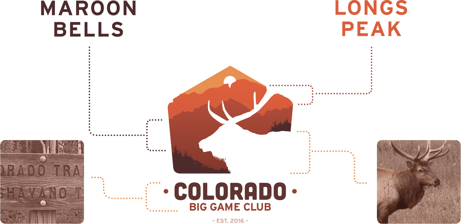
Instead, Wakegraphic suggested Cubano Regular (by C. Van De Water) for the project’s display font. Its bold, rugged, and rounded feel exaggerated the way that Highway Gothic looked when carved into wood. It would be complemented by Roboto Slab (by Christian Robertson) and Cabin (by Impallari Type), both free Google Fonts that helped lower the client’s expenses.

Creation of the Logo
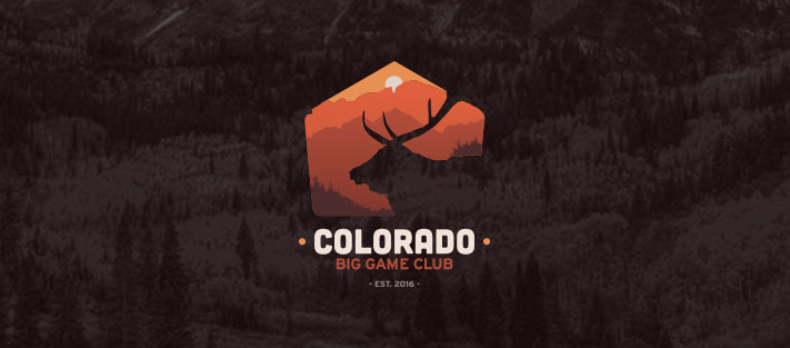
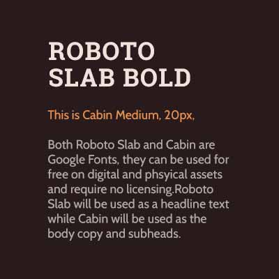
Logo creation was the next step in the branding process. The final design represented three different photogenic pieces of Colorado’s Rocky Mountains — Elk, the Maroon Bells and Long’s Peak. These were combined to build a logo that was representative of the state’s hunting, hiking, and conservation culture.







Applying the Brand
With the brand’s roots growing, it was time to apply the designs to real-world applications. The client’s brand would be expressed in three main ways: on merchandise, on social media and on their online store.
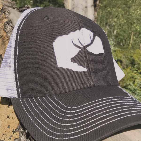
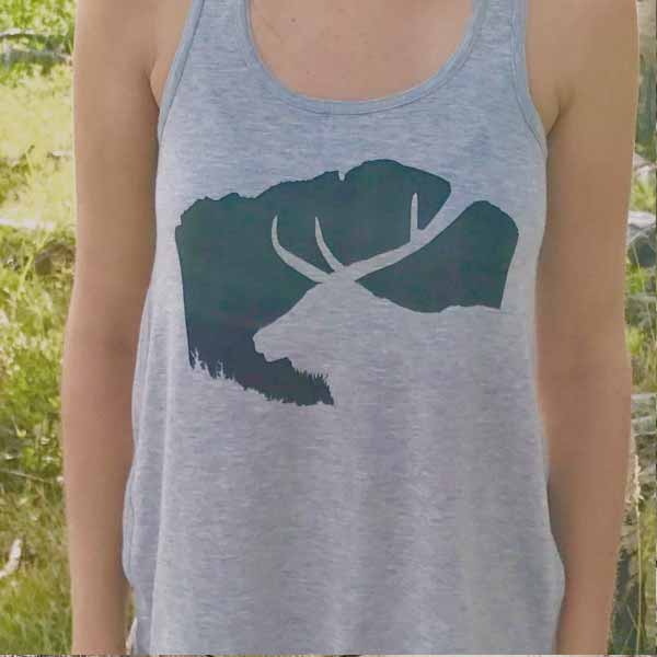
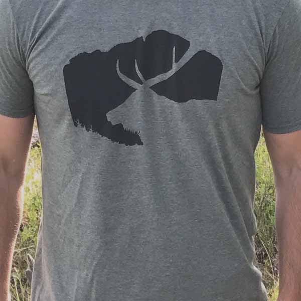
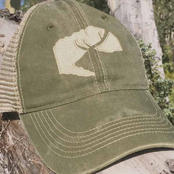
Launch day merchandise would include the new logo sticker designs, hat designs and shirt designs. A local print shops were contracted to create the stock. A simplified version of the logo was created for when printing constraints called for it. For example, the shirt and hats featured above use the simplified alternative logo.
Responsive WordPress and WooCommerce Website
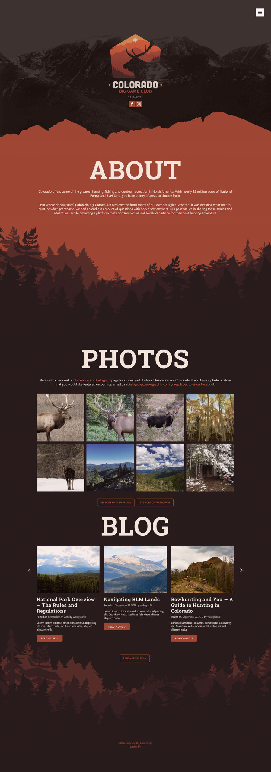
The client’s web store would be the final piece of their brand to be built for launch day. Since Colorado is such a photogenic state the client wanted a heavy emphasis on photography. For this client, the photography would be their own captures from their social media presence. In order to build their following, the client also needed a CMS that was easy to interact with and would allow for easy blogging. Because of this, WordPress and WooCommerce would function as the back-end for the site and store.
Easy to use, responsive design was essential for this project. Social media marketing would be the main source of visitors to the store. That audience would overwhelmingly be using their phones and tablets to be viewing it. The store and checkout process was built to be intuitive on all screens and devices.

